Design
User experience, front-end web, and print design projects
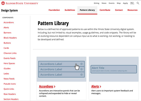
Illinois State Design System
Since the fall of 2018, my top priority has been leading the development of a design system to unify the digital experience across the University. The first public release was in July 2019. I continue to serve as the product owner as the system expands to a wider campus audience and is maintained among an increasingly larger team of designers, engineers, and content strategists.
User Flows
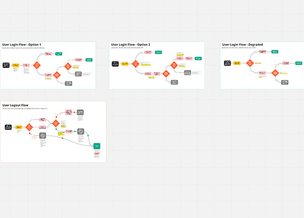
Logging in and logging out of systems at Illinois State were made more complex as the technical teams incorporated multi-factor authentication. After being added to the project to create visual designs for a few screens, I quickly assessed the need for mapping out user flows for these processes to reveal pain points, visual needs, content needs, and provide clear decision-making artifacts for project leadership.
User Personas
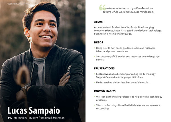
As the spread of design thinking and user experience spreads across departments at Illinois State University, user persona development has increased. More digital products and websites are utilizing personas as a tool during the discovery phase of product development, allowing clients to move out of the abstract and focus on specific segments with their visuals and messaging. I have created user personas for several projects on campus, this illustrates one used for assessing vendor products for a new IT Help portal.
Sketching and Wireframing
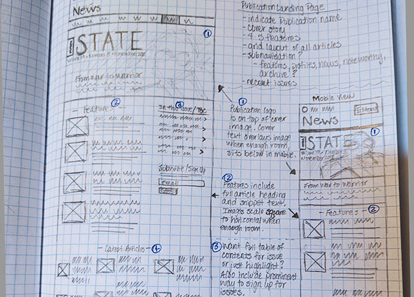
Most of my visual designs start with a pencil and graph paper. This image illustrates a detailed sketch created for the redesign of News.IllinoisState.edu as a conversation starter with the marketing department before progressing into detailed Adobe XD mock-ups, later utilized by a third-party vendor to build in Wordpress.
Workshop Facilitation
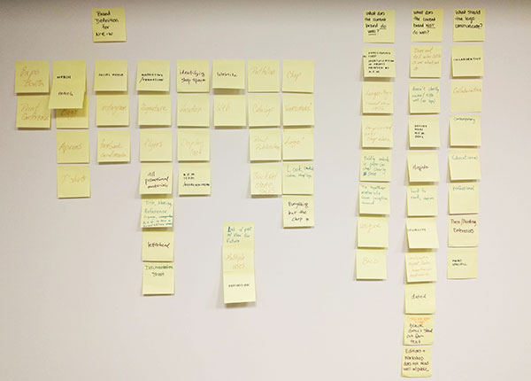
As digital strategy and marketing has evolved over the years to requiring specific goals and actions for people using websites and products, finding the why has become a necessary step in the discoverability process. These Post-Its illustrate a facilitation session I lead with printmaking faculty for a rebrand of Normal Editions. The workshop utilized a note and vote system to have the faculty quickly brainstorm and come to a consensus with the brand voice and tone before moving into a visual ideation phase.
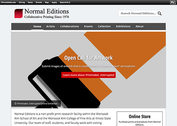
Normal Editions
Rebranding and updating Normal Editions from their original website created several decades ago to a mobile-first responsive layout on the University content management system was a two year-long project by Web & Interactive Communications. The project team consisted of a content strategist, several developers, several designers, and the faculty in Normal Editions. In my role as the lead designer I worked closely with the faculty to create a logo, separate from their printmaking chop, and the overall look and feel of the website. Quickly during the implementation phase of the website, several key components were identified as needing new development solutions, as well as coordinating a team effort in building out the long history of artwork from the print shop.
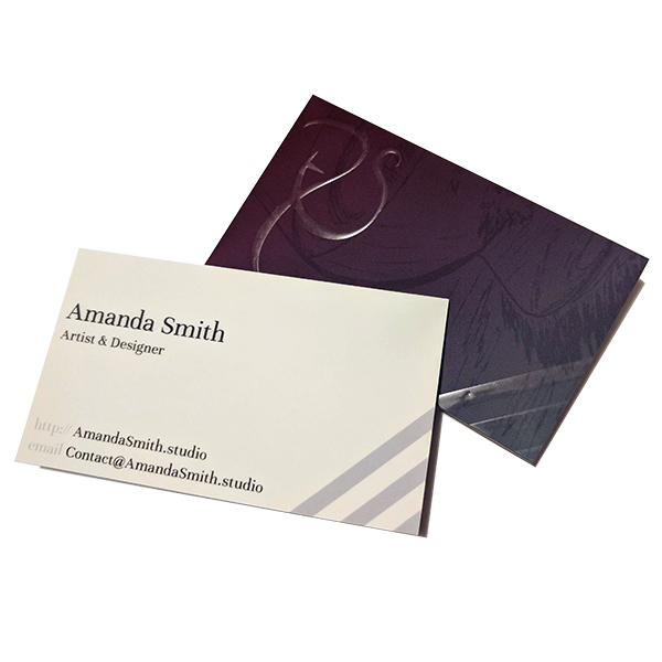
Personal Business Cards
Most recent design of my personal business cards incorporates a cropped section from one of my illustrations and raised spot gloss accents.
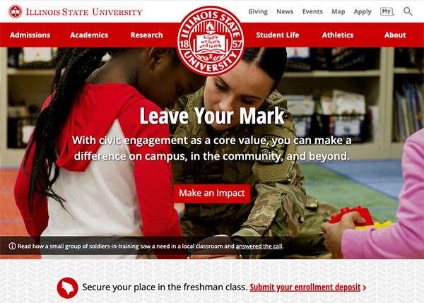
Illinois State University
Redesigning the flagship site, including the incorporation of all the admissions information into the main site was a large-scale, multi-year effort by Web & Interactive Communications. The project team consisted of several content strategists, developers, and designers. In my role as the lead designer I created the overall look and feel, met with constituents across campus, wrote the new user-interface, and managed the team of designers during the implementation phase.
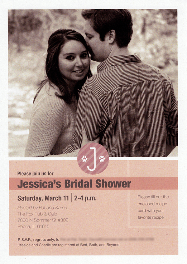
Bridal Shower Invite
Bridal shower invitation that included some personal touches for the bride-to-be.
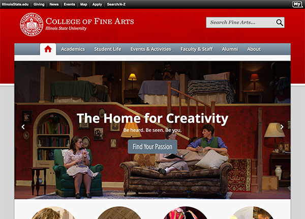
College of Fine Arts
Upgrading the College of Fine Arts from fixed width, multi-domain websites maintained through Adobe Contribute to a single mobile-first responsive layout on the University content management system was a year-long project by Web & Interactive Communications. The project team consisted of myself, a content strategist, and representatives from the Dean's Office. In my role as the designer I created the overall look and feel, worked with constituents throughout the college, coordinated photography, and implemented the front-end user-interface.
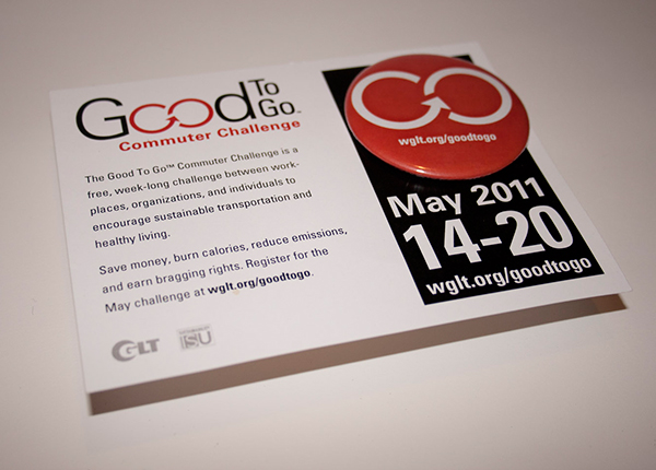
Good To Go Commuter Challenge
A local campaign originally created by WGLT and the ISU Sustainability Office. In my role as the lead designer, I developed the logo for the campaign and all supplementary branded materials. Since 2011 the yearly challenge grew beyond the campus resources and was taken on by the Town of Normal.
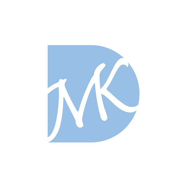
Monogram
Monogram for the wedding of Matt and Karen Davis. The monogram was used alone and on several stationary pieces I also designed for their wedding.